Monday, December 19, 2011

The Logo Design Process

I designed this logo for a campus group at UC Berkeley:

I tried with this logo to capture the precision and technical aspects of mechanical engineering while also bringing out the fun that binds together a discipline that is highly diverse: the fun of putting things together.

It's hard to understand the work that goes into a logo by simply looking at it; their nature is to be simple and direct. So, I decided to show my work through the graphic below. Enjoy!

Sorry about the image quality: it's hard to get really long images on blogger.

Monday, December 12, 2011

1950s SciFi: Them! and Plan 9 From Outer Space

 I'm doing some more art for Little Red Bicycle based on bad movies. These two pieces are representations of Them! and Plan 9 from Outer Space, each using the colors of the yarn.


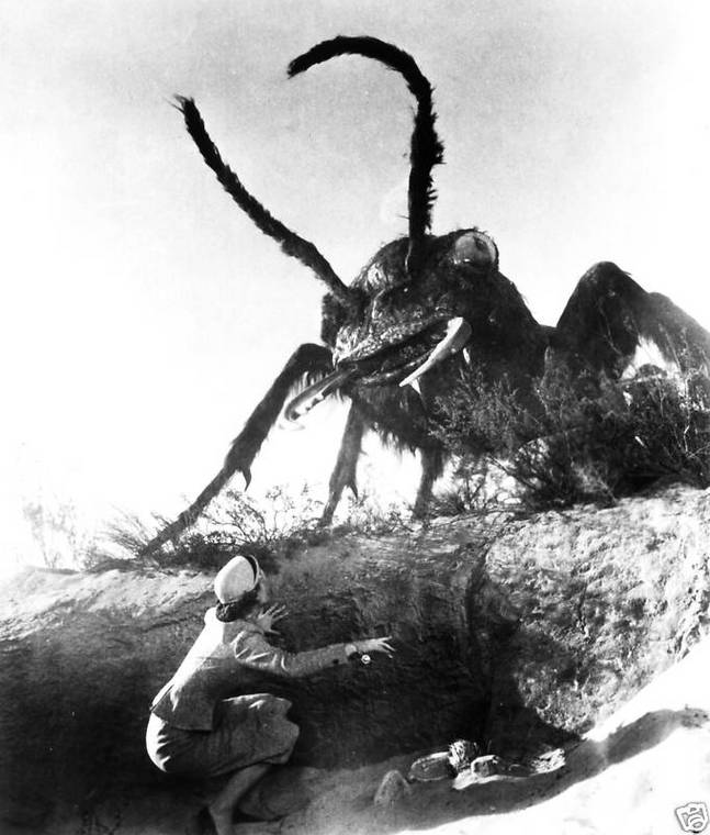
For Them! I drew an iconic movie still - the first time the giant radioactive ants appear on camera. This is the movie still I based the illustration on:


This was an interesting project because here I'm basically copying someone else's work right? I did this for a few reasons: the movie is actually good (despite its special effects) and has some excellent imagery, and budget constraints prevented me from spending a huge amount of time researching ant anatomy. This had me thinking as I went about rehashing this movie still as an illustration: what is my role as an illustrator? If the point is that this is supposed to look like a movie scene, then why am I drawing it?

I realized that there is a lot an illustrator can do when working from photos in the realm of clarifying and refining an existing image, much like someone touching up a photo. The ant effects aren't really that good in Them! and, though that's definitely part of its charm, as an illustrator I have license to improve the ant: to make it scarier and more defined, as in the detail shot below:


The art for Plan 9 is successful, I think, but it was more challenging. There are so many facets to the movie and the print size of this artwork is pretty small. So the task was to accurately depict the movie without cluttering the small image. The scene I ended up drawing involves a graveyard, the palm trees of San Fernando, flying saucers, and the living dead. I really did want to add in Vampira, the cheesy aliens, and Bela Legosi, but I don't think it would work visually.

I also recreated the text from the original movie poster which was pretty fun. Even the campiest typefaces have rigid rules that they follow.


Tuesday, November 29, 2011

You Only Have One Life

Ever since I designed my poster on the Seasonality of Californian Fruits and Vegetables I have been focused on doing graphic design that means something more than the sum of its visual elements - I want to design things that mean something. And I don't mean simply infographics. This is why I have been drawn to the "The Say Something Poster Project" competition. Here is my entry for their second season, "This Way Forward."


Thought Process

The prompt for "This Way Forward" said to "say something" to the next generation, given the past 2 - 5 years, to help inspire, motivate, and prepare them.

This is my "inspiration statement:"

Despite distracting much of this generation, gaming is about heroism. My poster uses gaming iconography to depict each person as a game hero who must save the prince/princess. But, crucially, we are not our game avatars: we only have one life to live.

My idea is that particularly in the past few years, our generation, today's 16 - 25 year olds, has become increasingly distracted by digital media. This is a problem: how do we remain productive when digital entertainment is so huge and pervasive?

While facebook and twitter and tumblr are more iconic of this trend, video games are a huge part of it - gaming is the grandaddy of all digital distractions! Games turned out to be a fruitful way to explore this problem and eke out some kind of message. You can say a lot of true (and truly boring) things about Facebook and Twitter: they cater to narcissists, they're all about networking, etc.. Sure there is a message in there, but I feel like people talk less about games (though that's changing) so observations about them just seemed more powerful:
  • games are about heroes
  • game avatars are insanely motivated
  • in a game, you are motivated through, and at the risk of, death
  • game avatars are in some way ideal selves
That last one, that game avatars are ideal selves - creatures or things or people that are more capable of doing the sorts of things that we normal people want to be able to do - made me think of this final bullet point:
  • real people, unlike game avatars, only have one life to lose.
A game wouldn't be fun if you could only die once and never play the game again after that. But, that's what our lives are. But there is something more to draw out of that. Game heroes do great things - that's part of what makes some games interesting. Doing great things is hard, so you naturally get more chances to do it.

And when you're on that last life, man, things get intense. You really want to keep going, you really do not want to fail.

This is true of video games, but isn't it true of real life?

We only have one life, why aren't we trying harder to do what it is that we want to do?

There's probably a complicated answer to that question, but that's not what this is about. That paradox struck me. If we saw life as a video game, if we saw our lives as video game lives, would we try harder? Would that realization that we only have one chance to jump on the bad guys, save the princess, and reach the flagpole, make people more motivated?

I think that if it doesn't in the long term, it is at the very least a reality check, in a quite literal sense.

So, that was the thought process behind my idea, and at that point I honed in on Mario as an icon of video  games that is universally recognized and from there I took on the task of creating a bunch of 8-bit "anybodies" to take the place of Mario in the design.

Design

I have grown a lot in the last few months as an Illustrator user, so I decided to do a quick mock-up of my idea in Illustrator. Normally I begin on paper, but this project didn't have so much in terms of illustrating and drawing to do. All the lines had to be right.


This is the initial mock-up. I hadn't built any of the assets yet so Mario is just repeated in the background. I liked this design broadly speaking, but the contrast between the text and the background is a little jarring.  In the stroked text I was going for something reminiscent of Nintendo's logo.


Though this was a reasonable first move, I feel like this is symptomatic of a design habit I have that I think carries over from typography: I always try to remain true to the theme of a central design element.

I am doing a logo right now, for example, that uses isometric shapes. In that design, I poured over many drafts that tried to make everything else in the design isometric in some way. Even though I was keeping with the theme, it just didn't look good.

Anyway, my next task was to design a bunch of people heads. I ended up making 42 unique heads with the 8-bit mario as my template. It was pretty challenging. I can't even think of 42 people off the top of my head. One thing that helped me get through all the heads was to design heads based on people I know and characters I love.

Some heads. Walter White and Badger are the bottom two.

8-bit David Bowie circa Aladdin Sane.

The final roster.
OK, so I got my heads together. The next issue was the typography. I cut down my message to "You only have one life" but I still had that ugly Nintendo font.

The problem that presented itself here was that there isn't really any good font to use with 8-bit design - unless the font itself is 8-bit. To solve this problem, I turned to the history of posters. I turned to the most famous of all posters, or at least it seems that way nowadays, the Keep Calm and Carry On poster from WWII Britain.


There are plenty of parodies of this poster and it's really quite recognizable, but I felt that the context of my poster is so different that my allusion to it in using Gill Sans and all caps was not all that passé.

So, I used Gill Sans, but of course it still doesn't look perfect within the confines of an 8-bit aesthetic. I redrew the text in an 8-bit style and used that as a drop shadow to create a transition between the text and the background.


That's the final text, but I got stuck on this version below for quite some time:


This image has two "drop shadows" - one in green and one in blue. I thought this would work because I was thinking of television monitors and RGB, but again, I got fixated on sticking to a design theme so much so that I didn't realize that it looked a little too messy. I still kind of like it, but oh well!

The final touch was to string some text around the border. I was worried that "You only have one life" was just a statement of fact that didn't help motivate or push people in the right direction. So I went back to my original text, "jump on bad guys" and extended that with some other text around the frame:


Visually I'm not 100% sold on the text but it's important, I think, to the message. Plus, this gives the poster impact at many different distances. You can read the central text from afar. The characters are visible from a medial distance, and this smaller text appears when you are closer.

I could fidget with this design for another week, but I think that the law of diminishing returns applies here and I'm happy to have it in my portfolio.

Thursday, November 10, 2011

Hamlet Book Design: aesthetics and usability combined


I recently designed a día de los muertos-themed piece inspired by Hamlet:


I liked this so much that I wondered what it would look like as a book cover. From there, it didn't take much for me to go ahead and design the entire book. Coming at this project as an artist with an English degree who practices human-centered design, I felt like my book design might be able to do the following things, which I feel are sometimes forgotten or even never considered:
  • Create a unified visual aesthetic throughout the entire book.
    1. It is often the case that the cover design/art is done by someone other than the book designer. Here I have the chance to build a book in its entirety.
    2. As my design began with the cover art, I have a particular chance to make the book layout and design extra striking.
  • Design the book layout in a way that is true to the traditions of book design, but which also emphasizes design for usability.

    1. As Hamlet is a play from the early 17th century, this book needs to function for actors and directors, users with specific needs which I will go into.


The Cover: selecting typefaces and designing a spine

The cover of the book is the visual beginning of the book design, both in terms of what readers see and in terms of my design process. I took visual cues from my original cover art to think about my aesthetic.

As I wrote in my post about the art itself, the skull is a día de los muertos-style representation of Yorick’s skull. I felt that Yorick’s skull, as the skull of a jester Hamlet loved as a child, embodied several key themes of the book: insanity and madness, severed relationships, and death. I draw out madness through the día de los muertos sugar skull and its exaggerated carnival designs. My sugar skull is of course a variation on traditional día de los muertos designs in that the character of the lines is derived from 16th century blackletter lettering and gothicism. The violence of Hamlet comes out in the color choice of the art: red and white (blood and bone).
Note the historical, and now obsolete, center justification of the back cover text.


Choosing typefaces

Though my art is a postmodern pastiche of these two styles, I wanted to ground the rest of the book design in that 16th century historical moment. This meant choosing typefaces true to this Shakespearian time. There are several digital versions of classic 16th century and incunabula  typefaces, and I ended up selecting Adobe Jenson Pro, cut by Robert Slimbach. One of the main reasons I chose it is that the periods are diamond shaped, much like the diamonds that decorate Yorick’s sugar skull.
Adobe Jenson Pro
The diamond ellipses
Adobe Jenson is based on a Venetian typeface by Nicolas Jenson, which initially turned me off. I had been looking for a good typeface by a Danish or at least Northern European designer - as if the book were from the historical moment of Hamlet itself. Hamlet, however, is based on 12th century legend and at that point a carolingian typeface would have been more appropriate, but ultimately unreadable at length. So, I decided to go with something Shakespeare would have recognized, and I’m happy with the choice. Adobe Jenson is beautiful and idiosyncratic.

This being decided, I felt like using a blackletter in combination with Adobe Jenson would further the sense of the historical moment of Hamlet and set the design apart, since no one really uses blackletter anymore. I landed on a free font designed by Dieter Steffmann called Moderne Fraktur. It’s a highly readable blackletter and despite its high x-height it goes well with Adobe Jenson. The cross bars on the "e" characters are both diagonal and they share a kind of roundness in their letterforms.
Moderne Fraktur and several faces of Adobe Jenson working together.


A striking spine

Before I continue to the text itself, I want to bring up the spine design. It is customary for book spines to have the author, the publisher, and the book title. Because Hamlet is such a well-known title, I didn’t feel that the author was necessary at all. Visually, it detracted from the spine design’s stark contrast between red and white, blood and bone. The result is a simple and severe book spine which stands out on a bookshelf.


The simplicity afforded by skipping the author's name lets this book stand out in the crowd.
My book among some successful book spines.

Inside the Book: aesthetics and design for usability
Traditional typography with some important changes. Read about them below.
Aesthetically, the book largely honors traditional renaissance book design, with a few crucial differences.
To begin with, the page size is a golden section proportion. The golden section is the self-repeating 1 : 1.62 ratio which defines the scales of the human body among many other aspects of nature. This pleasant ratio has been used for 1,000s of years in every type of human design, and was common during the renaissance.
Margin design as described by Jan Tschichold
Proportions of the margins
The margins are a modified golden-section relationship, as defined by Jan Tschichold in The Form of the Book, where the bottom margin is twice the inner margin, not thrice. In this configuration, the margins lock the text block into place. This is particularly important considering that this is a play, and the right margin is very loose and ragged.

In terms of typography, the body text is simple but readable. Character names appear in small caps and lines of dialogue are indented 1 em to make it clear when the speaker changes, something which would otherwise be confusing at times.

Extra care was taken with the bracket characters around stage action. Though stage action is italicized, the brackets remain roman. I do not feel that italicized brackets are appropriate or historically true, so I didn’t use them. Besides, the extra thin spaces and roman brackets give an extra sense of care and refinement to the typography.
Note the roman brackets and the use of Moderne Fraktur inside the book as an aesthetic echo of the cover.
You will notice that the line numbers are away from the spine rather than both on a particular side of the text. I did this for a few reasons. The first is that aesthetically, I need to acknowledge the page spread as a unit. The page itself is important but we also see experience pages together in spreads. Secondly, line numbers are reference information, and reference information such as page numbers, the act and scene number, etc. need to be toward the outer margin or they aren’t useful as you flip through a book. This serves the additional end of typographic unity: all reference material is located together, in the outside margin.

designing for usability

The elephant in the room at this point is the fact that I imagine this book design as printing in two colors: black and red. While this is ultimately a more expensive option, it is visually striking and incredibly useful in ways that set the book apart, both from other books, and from e-ink devices.
Red and black inks separate reference material from the text proper.
Visually, the red ink binds the text to its cover design, but how is the red ink useful? I realized when designing this book that in reading a play there are two basic ways of looking at a book. The first is obvious: reading. This book is traditional in terms of its design towards readability. The second is also important: searching. Plays are texts through which performers and directors are bound to leap. Actors may read several hundred lines and go back to practice at a specific moment, or they may begin midway through the book and then go back to practice earlier parts. Actors may only want to read through scenes they are a part of. Searching for the right line is a unique part of reading a play and it must be made easy to do. It is also separate from reading, and thus is must be separated typographically.
Thus, red ink denotes and separates reference material. Differentiating the colors makes it easier to focus on either the text itself or the reference numbers and materials. I should also note that modern synonyms to the occasionally antiquated words of Hamlet also appear in red. So, as an actor, this two-toned system will help you find the right material, and then focus on it when you do.
I call this book concept “the globe theatre performer’s edition” because I focused my design on the needs of actors reading texts. The scale and binding of the book have been selected with these needs in mind. Blocking and physically acting is an important part of reading a play even before actors go off-book. For this reason, this edition has to facilitate one-handed reading.

The book is 4.75” wide for this reason. According to the human-factors book The Measure of Man and Woman, most men and women can accommodate a 4.75” object between their thumb and the final joints of their fingers, so the book is very holdable.

Every aspect of the design must be considered: holding the book with one hand makes performing with it comfortable.
A book designed to be held.
The book is also loosely bound, so that the pages will lay flat even if you’ve just purchased it.

The book opens flat because it is not bound very tightly.
Behold the reason that margins exist: a place for the thumbs.
Conclusion
Maybe the best part of this project was constructing the prototype book. As a matter of full disclosure, I only printed out the first act. The rest of the paper in my bound copy is scrap paper. It would have been pointless pain in the ass to stitch all those signatures together. There’s nothing quite like seeing your work in front of you, physically realized.
Having the physical prototype in my hand was also incredibly useful. Holding the book gave me more insight than I could have ever had staring at an InDesign file. The book feels great in the hand. If I could change anything, I would probably make the book’s width even thinner and use some quality paper.
Working with book design has been interesting because there are so many rules to follow, so many conventions. At times it doesn’t really seem like you can call your work your own, since you’re working from so many elements that other people made, masterfully I might add. But this is also a rewarding context. The elements of typography are hundreds of years old and these people whose work you are using are, again, masters. So even if I made only a few innovations in designing this book, those are innovations set against the backdrop of masters of this craft. I feel honored and humbled to have done so.

A book can spring to life when it is printed.
gorgeous letters are the key to successful typography

Saturday, November 5, 2011

Cretan Landscape Studies

These are sketches for a work in progress, a children's book on the legend of the Minotaur.  I have spent some time studying Greek illustration and painting on amphora in preparation for this project, and these landscape studies are an attempt to develop an aesthetic that evokes classical Greece while incorporating perspective, greater detail, and a more expansive scope than anything Greeks painted. Each of these sketches depict Crete, where my story begins.

The Idean Cave, Psiloritis Mountain
 The Idean Cave is where Rhea hid Zeus to protect him from Cronos. I chose to draw the entrance to this cave because it seemed challenging. Mediterranean mountains are characteristically craggy and the question of how to render them in illustration seemed like an interesting one to solve.

A craggy landscape daring any illustrator to draw it.
Psychro Cave, Lasithi
Psychro Cave is where Zeus was born. It is a remarkable and sacred cave, with towering stalagmites and a sacred alter in its lower chambers. These alters were used to sacrifice bulls and other animals to Zeus. I thought this was a challenge as well, considering the complicated forms that stalagmites take in the cave.

Psychro Cave, full of stalagmites and cool lighting
Ocean off the southern coast, Psiloritis Mountain in the background
I imagine Talon, the bronze giant who protected the shores of Crete, walking along landscapes like this one. I have been interested in drawing water in an ancient Greek style. This was particularly challenging because the Greeks never draw water the way we draw it, but I think I cracked it with this.

Highlighted here are Greek depictions of water.
The Eleusinian amphora above has a few representations of water in it. I was drawn to the guilloché, the intertwined rope-like waves that form a border. This is a common design in architecture, but at first it doesn't seem really usable as water. The Greeks used the guilloché to depict the barrier between air and water, but the question is, how to use this in perspective drawing? My thought was to stack guilloché and draw them as water waves, with peaks and crests.

Monday, October 24, 2011

Hamlet Print

My last piece was "Day of the Dead" themed, and it turned out really wonderfully. It combined intricate patterning for which Illustrator is ideally suited, and faux-graffiti airbrush effect, two Mexican aesthetics, which came together quite powerfully.

I was so happy with the result that I wanted to do more. The piece I am writing about here, below, is in the same vein, but with a few important differences. Inspired by Mondo Tees, a company that remakes old movie posters, I came to the idea of doing a print based on literature. I think that prominence of skulls in day of the dead art led me to do a piece inspired by Hamlet, that and my level of familiarity with Shakespeare. The connection of course being the famous visual of Hamlet in which the title character comes across the skull of the old court jester Yorick in a graveyard as he returns to Denmark to kill the usurper king. So I've done a sort of visual representing Hamlet, and specifically his monologue on Yorick in Act V.i.

Alas, poor Yorick! I knew him, Horatio; a fellow of infinite jest, of most excellent fancy; he hath borne me on his back a thousand times; and now, how abhorred in my imagination it is! My gorge rises at it. Here hung those lips that I have kissed I know not how oft. Where be your gibes now? (Hamlet, V.i)

The result is a piece that blends the Day of the Dead style and aesthetic with the aesthetics of early modern blackletter type. It's surprisingly how well the two work together, at least initially. While day of the dead art is an art of the people, made by everyone and anyone, this gothic typographic look is highly controlled and rigid. And yet, each style is highly ornate, and interested in basic line art, patterning, and symmetry.

The Day of the Dead seemed suiting to Hamlet (specifically this scene) for more reasons: both are about the dead and about remembering the dead. Each uses colorful figures to depict death as well, although in Hamlet Yorick's "infinite jest" adds to the melancholy of remembrance rather than negating it.

The almost paradoxical nature of the jester and the skull - the funny and the melancholy - seems suited to Hamlet, whose mistaken killing of Polonius drives him merrily into a thirsty bloodlust that ultimately produces his own doom. Because of this, I wanted Yorick's skull to be hypnotic, and likewise self-contradictory.

This led me to my color choices. I went with circusy primary and secondary colors and paper white. Not only are these reminiscent of the Day of the Dead, but they evoke the jester, celebration, and good times. And these bright colors perform this function against my base colors: red and white, for blood and bone. These are colors that catch your eye in their simplicity, but keep your attention as you realize their tensions. My design of the skull eyes further draws you in, as the insanity of death drew in Hamlet.

If you notice the structure of the colors in the artwork again, the main colors might be said to be red, purple, and gold, as well as the paper white. The red I chose again for blood, while with the purple and gold I try to evoke royalty.

In terms of what I learned working on this, I think I've found a great balance between working on paper and working on the computer. The computer is great for finished artwork and hand drawing is the only way to really design effectively. But there's more to it: the computer is great for establishing margins, guides, and proportions to aid the design. This design is based on the golden ratio, a recent favorite of mine, but only because I was able to work from guides I plotted on the computer. This really focused my artwork, and I think that for the foreseeable future I will lay down proportions shortly after my first sketches are complete.

I didn't really learn anything new on Illustrator this time around, which was kind of a let down, though I did get to do some problem solving working with pathfinder and gradients.

Finally, I got the idea as I was drawing this to try my hand at setting a book with this play, the illustration as the cover. We'll see if that happens but let's hope so.

Wednesday, October 19, 2011

Day of the Dead

 This one I'm pretty proud of. Once again on assignment for Little Red Bicycle, I had to create a stamp for yarn packaging. My guidelines were to use certain colors and do something day of the dead themed. This is the art I created:


I owe some credit to Didi for the baller colors. And thank you Alycia for letting me use your face.

For a while now I've been taking training courses in Illustrator and naturally I want to try and use the stuff I learn. What I was really able to take advantage of this time were gradient meshes. Gradient meshes allow you to simulate a kind of airbrush effect when done correctly. These are the gradient meshes in my piece:


I wanted to use these with this project because when I think of Mexico and Mexican art one place I turn is towards street art and murals, which are done with spray paint.

I'm trying to master pattern making as well, and what better subject than Day of the Dead to try some patterning out? I think my candy skulls work well. I didn't want to make them insanely detailed because they are background elements, and I think I needed to keep some balance between the business of the face and background areas.

One thing I tried that didn't work was simulating a bad press job, where I would apply grains to each of the separate colors in the piece, as if I had printed all the purple on one block, the pink on another, etc. The piece is so busy in the first place that it ended up being distracting and ugly. Though, if you notice the text, I did mimic poorly aligned printing/stencil art in the process of making the print more legible.

Overall I'm really happy with this and I want to do more work like it in the future.