
This is a logo I did for a website called MegaJoule. The website will be a kind of network for energy analysts and people interested in energy numbers and predictions.
The trick with this logo was that the site needs to have credibility and and yet be more upbeat, as it will be a network that relies on users coming back over and over.
Credibility was a complex thing to think about, typographically, because it was entangled with "tech" and a "hard numbers edge" in this business. I visited some sites that I deem to be credible (Wikipedia, Britannica, NYTimes) and went through my font collection looking for something that said the right things to me.
My first pass was interesting. I had a few very different selections.
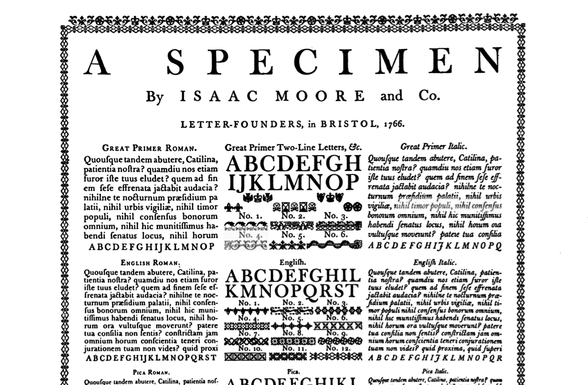
I thought of Baskerville. For me I think of Baskerville next to steam engines, industrial-era technology. All of these energy-related inventions of the 18th and 19th century say "Baskerville." The problem is that this is the 21st century.
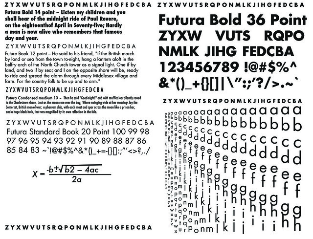
Futura, even though it's pure art-deco, is a very current looking typeface. It's problem is that it doesn't say credibility the right way: it's too exciting.
I settled on Junction, by The League of Movable Type. It's a humanist sans-serif, so it's got a liveliness that other sans-serifs don't have, but it has lines that can work together to create a solid block of text, which creates a sense of seriousness.
I would also say that the "credibility" I was looking for in typography came out more in how well the logo turned out as a whole. That is to say a well-designed logo automatically gives a product some extra credibility.
No comments:
Post a Comment