Saturday, August 20, 2011

Stamp Art

The theme for my latest commission was travel, and more specifically East Asia. This is my final product, and I'll walk through my inspirations for the finished piece.

I was provided with a specific image as inspiration, this great photograph from user ~FurSid:

Pretty Red


The beautiful deep reds and gold made me think about Indian dancers performing the classical dance Bharata Natyam, as seen here:


I found these women incredibly gorgeous and knew that these dancers would form the centerpiece of whatever came out of this. Adding the travel aspect to the piece took more thinking time. My girlfriend suggested to me those stickers that people used to get on their briefcases whenever they traveled to new towns and countries and it clicked in my head: postage.

As it turns out, there are several examples of beautiful postage design from India out there:


As it turns out, these dancers are already on postage.

The etched stamps drew my eye. Not only did this style remind me of contemporary artists like Sheppard Fairey, but the older forms of etching and press printing fit my limited color palate of red and gold. So I sketched out a dancer.

I'm pretty happy with it and this project has made me interested in moving on to larger scenes, with more pieces as opposed to single figure designs.

Wednesday, July 20, 2011

Wino

My parents are big wine drinkers. I mean, it's usually one bottle a day or a little more. They just enjoy their wine. They also have difficulty throwing things away. My mom will try anything to get a piece of junk overgrown with leaves and vines in our garden. She likes the look.

So at the end of the day, they've collected years' worth of wine corks. My parents say 2-3 years' worth, though I suspect it's more. I'm always looking for an art project, and the wine cork in quantity presents a unique opportunity for "upcycling," sustainable design, aesthetic design, and what the Eames' called "honest use."

This is what came of these wine corks: a table I call the Wino:

The Wino

There are many aspects to the Wino, but the centerpiece is the flat table top made from hundreds of wine corks. I think of the table top as a series of tree-rings, detailing the last two years of my parents' spirit consumption. The occasional tequila and champagne cork tops add some flair.

The table has a wonderful wine aroma. As a note, around 70% of the corks are Charles Shaw.
The Wino is one of my first attempts at presenting recycling, honest use, and sustainable design in an aesthetically pleasing way. The table is made entirely (with the exception of the clear top) of existing materials.

Chair legs with the pegs cut away.

My table legs were actually part of a chair I found at Urban Ore, a salvage yard, in Berkeley. I was drawn to the color of the American Walnut wood, but the chair held more surprises, including the key to making the Wino without nails and using the wine corks themselves to hold everything together.

At UC Berkeley as part of the design group Berkeley Innovation, learning human-centered design in ME110 and with the aid of the Berkeley Institute of Design, I have learned to focus on process. A process which involves user-needs research, analysis, and several iterations to satisfy the needs of users. With this project, I had no users and I needed to focus on materials. While I ultimately should have planned more, the haphazard make-it-up-as-you-go process led to a more clever design in the end because it allowed me to capitalize on chance discoveries.

What I mean is the fact that midway into my build I realized that the beams between the chair legs that I cut away were the exact diameter of the corks I was using. I used this fact to create a surface for my table to rest on without nails:

I owe this elegant solution to chance.

Honest Use

This chance discovery solved the irritating compromise I was planning to make in using screws to secure everything together rather than finding a solution in the existing materials themselves. It is also an example of what the Eames' called "honest use." This phrase "honest use" comes from Charles Eames' work with Eero Saarinen in the late 1930s on what would be the first of the famous Eames plywood chairs. At that time plywood was a very new creation, and its flexibility and strength awakened the creative spirit of many designers. Eames and Saarinen began a series of experiments with the material that sought to use it "honestly;" i.e. to create artwork and designs that relied upon its flexibility and strength. For Charles and Ray Eames the result was the Eames Lounge Chair Wood, a (once) inexpensive and lightweight chair that used plywood's natural flexibility and strength to express a Modernist simplicity of bare curves as well as proper seating.

Honest use of plywood in the Lounge Chair Wood


This has always inspired me and I think that with the Wino I've successfully captured some sense of honest use of the cork. Most corks are of uniform height and are thus capable of creating surfaces with pressed together, this is the table surface. Cork is also naturally flexible. Its ability to expand and contract creates pressure. Pressure is the key to this design. It is what keeps the cork-pegs in the legs, and it is actually what holds the legs vertical in the first place.

Embedded alongside the corks are the table legs.

Placed alongside the corks are the ends of the four table legs. The cork-pegs support the top of the table, and the top of table actually supports the legs. The pressure of the corks pressed together is enough to hold the table legs vertical in the top of the table. The result is considerable stability without any nails. The design relies mainly on the compressed corks for stability. It works too!

Sustainable Design through Upscaling

The other design ideal that I've aimed for is sustainable design through upcycling. Upcycling is the process of taking used materials and, through creative reuse, making them more valuable than they were before. This is one particularly bright future of recycling. As I said, aside from the clear acrylic table top (Clear Acrylic AR 1 if you're interested in making one), every part of the design is reused. Each wine cork, which are for the most part sustainably harvested in Portugal, is from a finished bottle of wine. Continuing with the wine theme, the iron ring which contains the wine corks is from an old wine barrel.

My mom had a bunch of wine barrel rings in her garden. Thanks mom!

The base of the table, too, is made from old wooden wine crates.

Each slat of wood is from an old wine barrel. The result is so pleasing to me that I want to make a table with this as the top.

In terms of a piece for potential production, material cost is a non-issue but material availability is. Now that I've learned how to make this table, I wouldn't say that the assembly is difficult. In terms of materials cost, the corks were free to me as were the iron ring and wine crates.  The chair cost me $35 to disassemble, and the acrylic top was $80 to have cut at TAP Plastics. I think that the materials would cost between $150 and $200 for each table. Finding those materials might be the hardest part about production. As I learned in the hunt for wine crates with beautiful typography burned into their surfaces, these old wooden crates are quickly becoming a thing of the past, now replaced by lighter, cheaper cardboard boxes. Only the most expensive wines are sold in wooden crates anymore. So, as an idea for furniture in production, this design would ultimately be faced with an absence of recyclable wooden wine crates. Nonetheless, the success I feel with the Wino signals to me the possibilities of upcycling as a force of sustainable design that goes beyond novelty appeal. I feel proud about the end product not just as an example of sustainable design, construction, and honest use, but as an aesthetic piece in itself.

Lessons Learned

I've learned a couple of things in the process of making this table. My biggest takeaway had to be that the design probably shouldn't always be planned out in advance of toying with the materials. Discovering that the peg holes in the chair legs were the same size as the wine corks was nothing short of an epiphany and really solved a lot of problems in the design, simplifying it, making the final product less susceptible to inaccuracies in drilling, and really getting me out of a slump. I wouldn't have realized this if I had thought out my design entirely before interacting with the materials. I think that I will steer my future designs towards a hands-on approach that allows these types of discoveries.

That said I do wish that I had created a plan for construction before I actually started building. I spent a lot of time just trying to figure out assembly.

Adding the final corks while trying not to disturb the alignment of the table legs or the circularity of the iron ring.
I think that this leads me back to the iterative process of design. The Wino, in terms of my assembly methods, should be seen as a work in process. If I was interested in pursuing this design further I would basically start over with the problems of assembly that I had and try to analyze and synthesize better solutions.


Tuesday, July 19, 2011

More Greek Design

I figured I should start doing things in series, so here are two more Greek-styled pieces of art. One is the Kraken, the other is Zeus. I'm not 100% happy with Zeus. I think I gave his face a little too much character, but he is what he is.


Saturday, June 18, 2011

Guerilla Ergonomics

Our world wasn't designed to be sat in correctly. That's what I learned in Galen Cranz' graduate course in Body-Conscious Design at UC Berkeley. And unless you have a few $1,000 to invest in proper seating, you're SOL. So I try to get by with something Cranz deemed "guerilla ergonomics" - but I'm taking it to the next level.

Here's the first in what should be a long series on guerilla ergonomics:


This is my friend Emma sitting in front of Ramona's at UC Berkeley. There are a few things wrong with the outside space in front of the Architecture building, Wurster. The big problem in terms of body-conscious design is that there are very few table surfaces. I could maybe understand that the space is meant as a socializing area, but people eat here and people study here. Face it, it's UC Berkeley.

So what ends up happening is that people use their laps as laptop and book surfaces. This does terrible things to the spine and neck as you curl your body down towards your legs in an attempt to get a comfortable reading distance between your lap and your face (about 18 inches for most).

Couple that with deep, deep benches along the walls which force your body into an acute, crumpled posture (one of Cranz' main arguments is that the 90 degree seat is an atrocity) and you have problems.

The chairs that exist outside of Wurster aren't 90 degrees themselves. They're actually more like 120 or 115, with the seat going back. This is all fine and well unless you want to look at something; supporting your neck when you're in a reclined position is a strain that can cause neck pain.

Here I've taken the chairs outside and stacked them reversed, using their reclining angles to create something beneficial: an angled desk. The angle brings the reading material up to better align with Emma's eyes (though this angle is perhaps too slight).

Additionally, the desk forces Emma to sit on the edge of the bench rather than back in it. This allows her to bring her legs down, opening the body and straightening the spine.

Friday, June 10, 2011

DesigNote


Last spring I took a New Product Development class at UC Berkeley and worked on a team to design a new notebook. I recently revisited the project, making an updated prototype for a friend. Here's a video:


Here are some excerpts from our final report that explain the decisions and research behind the design of the DesigNotebook as well as elaborating on two additional digital pieces of the design:

We interviewed two dozen users in a broad range of categories--professionals, artists, designers, architects, and engineers. In analyzing our interviews, we found several core user needs. Breaking them down into categories using frameworks such as CCAQ and Use, Usability, and Meaning helped us hone in on the core issues beneath specific needs as well as helping us identify different types of needs.


Sustainable design is a large part of any designer's concerns. Particularly in the field of paper products, sustainability is key. We found that our DesigNote prototype was ideal as a paper product because of its modularity; often we found that users didn't finish their notebooks. With the DesigNote, this could potentially never be the case.


Making the final DesigNotebook prototype was a matter of detail design. Choosing materials and refining the binding system and overall construction were the main tasks. We mimicked a user’s paper selection, from watercolor to graph paper, to demonstrate the variety of usages our product would have. Adding tracing paper, for example, allowed us to demonstrate that a user could draw something in their notebook and then trace that image in a single notebook. Taking inspiration from Moleskine, we found a cover material similar to oilcloth to make the notebook feel valuable. 


Refining the removable binding system was a big challenge. Our original idea was to have a removable binding attached with velcro on the front and back of the notebook, but we found that the ends of the covers do not come together when you open the book; the pages bubble out instead of laying flat. We currently have this removable binding slip into some guides on the back cover so that the binding can slide, allowing the covers to come together. This solution still needs refining, but it is a major step forward.


The final concept is a suite of three products. The modular notebook concept was one of those products. Because the notebook, the DesigNotebook, is accordion-style, each page is connected to the next instead of a back binding. This allows the user to stretch all the pages out to view multiple parts of the notebook at once. We created a system to also allow users to remove or insert paper, making the notebook fully customizable and essentially everlasting. Because the binding is no longer needed except to hold the covers together, we can move it around so that the user can reorient the notebook and use the backs of the accordion-style pages. This solves a need of having multiple notebooks by putting them together, while still keeping them separate. 

We refined our hybrid solution into the DesigNote app, featuring a notebook tagging feature inspired by Microsoft Tag that easily crosses the analog to digital gap whilst supporting the existing culture. DesigNote End of Life archives notebooks while allowing users to view all of the tagged content in the context of their entire notebook. While not entirely dependent on one another, this suite of products works best together. The DesigNotebook has removable signatures that can be easily scanned (especially through a feed scanner), and having multiple areas of your notebook open at once allows users to access much of their tagged digital content with speed and ease. We felt that these products should be relatively independent, though, because the one thing that all of our users did was design in their own unique way.


The app and End of Life demos were developed as a series of Keynote presentation slides. Running through the slides demonstrates a user experience. Ian made an iPhone app demo with vector-based images in Photoshop. Betsy and Darren made the End of Life demo with Photoshop and Keynote, embedding videos and media to make it look like our scanned notebook pages were really displaying the tagged media. While we have not thought about the software architecture or how to actually make these programs, the “Wizard of Oz” prototype helps us not only demonstrate our concepts, but critique them to find ways of improving the products. Indeed, sharing our concepts with some of our interviewees prompted new questions about usage.


For more information and documentation shoot me an email.

Friday, June 3, 2011

Io art piece

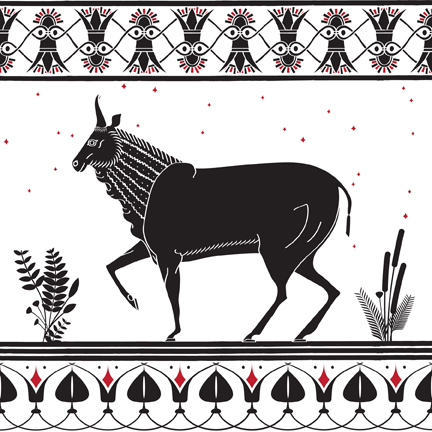
I just finished a piece depicting the Greek naiad Io:


The story of Io, ala Wikipedia, is fairly interesting:

According to Ovid, one day, Zeus noticed the maiden and lusted after her. As Io tells her own story in Aeschylus' Prometheus Bound, she rejected his whispered nighttime advances until the oracles caused her own father to drive her out into the fields of Lerna. There, Zeus covered her with clouds to hide her from the eyes of his jealous wife, Hera, who nonetheless came to investigate. In a vain attempt to hide his crimes, Zeus turned himself into a white cloud and transformed Io into a beautiful white heifer. Hera was not fooled. She demanded the heifer as a present.
Hera tethered Io to the olive-tree in the temenos of her cult-site, the Heraion, and placed her in the charge of many-eyed Argus Panoptes to keep her separated from Zeus. Zeus commanded Hermes to kill Argus; Ovid added the detail that he lulled all hundred eyes to sleep. Hera then forced Io to wander the earth without rest, plagued by a gadfly (Οίστρος or oestrus: see etymology of "estrus" ) to sting her into madness. Io eventually crossed the path between the Propontis and the Black Sea, which thus acquired the name Bosporus (meaning ox passage), where she met Prometheus.
Prometheus had been chained on Mt. Caucasus by Zeus for teaching mankind how to make fire and tricking him into accepting the worse part of a sacrifice while the mortals kept the better part (meat); every day, a gianteagle fed on Prometheus' liver. Despite his agony, he comforted Io with the information that she would be restored to human form and become the ancestress of the greatest of all heroes, Heracles (Hercules). Io escaped across the Ionian Sea to Egypt, where she was restored to human form by Zeus. There, she gave birth to Zeus's son Epaphus, and a daughter as well, Keroessa. She later married Egyptian king Telegonus. Their grandson, Danaos, eventually returned to Greece with his fifty daughters (the Danaids), as recalled inAeschylus' play The Suppliants.

I did this piece in record time. It took maybe 10 hours to design, draw, and finish everything.

This project is part of a more broad interest in Greek artwork, so my source image is, of course, from Greek pottery:


There were three things that I was interested in appropriating for this piece: the cow, the repeating floral designs, and the foliage. I think a lot of people underestimate the power of classical drawing. Simply because a thing is, well, simple does not mean that it is any less great. I think that Greek and Egyptian drawing is actually iconic rather than merely simple. Any art historian could point out baroque or rococo paintings, but pretty much any westerner could point out ancient art like this.

Anyway, the cow is great. This is my quick rendering on the cow on paper (always start on paper):


I worked out the remainder of the details in illustrator. As practice soon confirmed my intuitions, illustrator is not the ideal vehicle for the drawn aesthetic of Greek pottery. That said, illustrator made some things particularly easy.


I wanted to work with floral patterns, and I also wanted to learn how to use the software's brush options. For each pattern I designed (carefully, over many a guide line) only a single repeating section and then imported that into the "pattern brush" options. I had some problems with it, but it all worked out. Again, one thing that this misses, though, is the drawn-aesthetic. That is, all my floral designs look the same and are without human error or variation. That's something I'll look to fix in the next piece I do.

I tried to counteract the precision of illustrator with some sloppiness and the use of the 1pt oval brush on my pen strokes. That helped a little I think.

The final bit I focused on were those little bushes around Io. I followed this tutorial on art brush creation to good effect.

My final illustrator image was cool, but it didn't really capture Io in the way that I wanted it to. I felt I could fix this through colorization and texture, two things in which Greek pottery techniques exhibits limitations.

My idea was to bring the blues and greens of pastures, rivers, and the sadness of Io in her cow form, into the piece with Photoshop.

I found some textures on the great, free website CG Textures and manipulated them in photoshop. I took an image of water and brought out its blues, adding greens and gradients too. I added cracked plaster textures using the Darken blend mode to give the image deep colors and age.

Because I made this picture for a smaller print, I created a more-readable image without the textures too: