Wednesday, October 5, 2011

The Seasonality of Californian Fruits & Vegetables

New poster I designed. On sale at Etsy right here: The Seasonality of Californian Fruits & Vegetables


Each fruit was hand-painted by me in watercolor.


It is set in Adobe Caslon and Garamond.


13"x21" it makes a great addition to the kitchen.


Saturday, September 24, 2011

Galapagos Stamp

Did another piece for LRB yesterday. This one is a Galapagos Stamp

I'm pretty happy with this piece for a couple of reasons. 1. I think it looks great for a single color print, and 2. It took me 5 hours to make.

I've been dedicated to learning more about Illustrator and while I haven't learned how to achieve certain looks that I was incapable of achieving before, I have become smarter and faster in my workflow, using pathfinder options and clipping masks to reduce hand editing and, what I used to do, moving the work into Photoshop to apply textures. So, using compound shapes and global colors, the execution phase of my design work has sped up dramatically. Yay me.

The color is based on Didi's colorway, which itself is based on the color in this picture she took last year in the Galapagos:

Smuggest of all sea lions

It's a beautiful but unusual considering the things I think of when I think of the Galapagos. I think of reds, blacks, and whites for the bones of animals, the magma rock, and the spots on the Marine Iguanas. I think of Blue-Footed Boobies, and Galapagos Tortoises.

Anyway, it worked out well!

Monday, September 5, 2011

Yarn-Bombing Fairy


A recent commission asked for a piece of fairy tale art involving yarn. My idea was to have this fairy do some yarn-bombing in an enchanted forest and this painting is the result.

First of all, this piece is heavily indebted to the incredible illustrator Virginia Frances Sterrett. She did 3 books in the early 20th century before she died and they're all masterpieces. Since I don't typically do this type of art, I looked to her paintings for inspiration and stylistic cues. I also turned to more familiar fairy tale art from Disney cartoons like Sleeping Beauty and Snow White. I combined watercolor backgrounds with opaque color-pencil characters and foreground elements to approximate the cel-based animation Disney used to use. Cel-animation is the style in which moving parts of the animation are painted on transparencies which are placed on top of static backgrounds. Time constraints and the opaque medium used on the transparencies create an effect whereby the backgrounds are much more detailed while the moving elements are done more simply and more quickly.

My favorite part.
Lessons Learned & Relearned

Overall I think that the piece is successful, but I consider it an experiment; I am definitely happy with the execution but I think there are a couple of changes I would make to the original layout and overall harmony of the individual elements if I were to do future, similar, pieces. I think the issue was that I was so concerned with executing the project correctly that I took less time designing it.

Doing this project refocused my attention on the importance of color schemes as the unifying aspects of a lot of art. Because the style I chose necessitates two mediums -- watercolor and colored pencil -- that don't really mix together I relied on a rigorous color scheme to bond it all together. My main colors where Naples Yellow, Cobalt Green, and French Ultramarine.

Finally, this project took much longer than I had anticipated. While extra time spent learning new techniques is invaluable rather than problematic, I spent a lot of time on details that won't really show up in the smaller printing size of the piece. Sadly, these are my favorite parts of the painting. The problem arose when I chose to paint at triple the required size, I think. I did this partially for portfolio reasons and partially because I didn't want to end up with any image resolution problems, and also because my recently upgraded computer is capable of handling that size. I should rethink scale next time to improve my efficiency.

Detail

Monday, August 22, 2011

Soma Sofa


Last year I took a graduate course in Architecture called "Body-Conscious Design" which transformed my view of furniture design. Taught by Galen Cranz, the course explored the relationship between the body, design, and architecture and, while dismantling attitudes towards furniture design old and new, promoted the tenets of a design and lifestyle movement called "somatics." "Somatics," like the ergonomics that it seeks to refine and broaden, is of greek origin. Where "ergonomics" is the study of work, and thus our Aeron chairs and OXO brand items are confined to work-related activities, "somatics," meaning "of the body," offers the opportunity to take the kind of body-conscious thought of ergonomic design and extend it into the rest of our lives.
     So, somatics can involve work-related activities--it can discuss the proper table heights for different kinds of work--or it can be used to help with body movement and pain--the Alexander technique, for example, teaches people how to use their bodies, spines, and necks properly to prevent the pain that plagues most of western society. More to the point, somatics advocates can talk about how to sit, as my teacher Galen Cranz did in her book The Chair and continues to do so in her teaching. My newest design, the Soma Sofa, seeks to embody the somatic principles of The Chair and the course "Body-Conscious Design." It is my response to somatics, ergonomics, the failure of traditional furniture to provide comfort, and the failure of body-conscious furniture to penetrate the average consumer's living room.


Design
As I planned this project, I began seeing this particular loveseat in my parents' house as my benchmark. The loveseat is a terrible thing. It forces you to either sit upright at 90 degrees, or squish into an awkward laying position. Because there is zero head or neck support, the simple act of looking straight ahead, to a television perhaps, becomes strenuous. Your back curls into a C shape which, over decades, leads to humps and slipped discs and, in the short term, produces lower back pain. If you spend any time in the seat at all, blood will pool in your legs, increasing your risk of deadly clots. Sitting kills. 
     The Soma Sofa responds to the evils (yes, evils) of the loveseat in creating a lounging space for two individuals that performs nearly every function of the sofa while being more comfortable and less deadly. And though the Soma Sofa appears large, it is actually slightly smaller than a conventional loveseat.
     I want to start by talking about the mechanics of the Soma Sofa, or more precisely, the human body on the Soma Sofa.


The angle between the back and seat cushioning is 135 degrees, midway between sitting and standing. In the diagram from The Chair below, note how the lower back muscles perform nearly all of the work supporting the spine in the traditional 90 degree seat. Standing, muscle work is distributed between the lower back, the butt, and the legs, and at 135 degrees, perching, we get much the same distribution as standing. This perching position is an ideal rest position. Try this if you're interested: lay on your back on the ground and feel your lower body muscles. Laying completely flat, you should still feel strain in your lower back. Easing this into the perching position relaxes those muscles.


From Galen Cranz' book, The Chair
     What's more, laying as you do in the Soma Sofa evenly distributes the force of gravity on the body. This means a few things: you won't fatigue your body and you won't fatigue the Soma Sofa. Traditional couches tend to collapse overtime as the force of most of your weight in one spot (coming from your butt), compresses the foam or stuffing. Distributed evenly over a larger area, your body is more like a snow shoe, and has less impact on the furniture, making it possible to create lighter, longer lasting pieces.


You'll notice too one of the stranger features of the cushion in the back pad: butt space. This is a key aspect of the Soma Sofa. As I noted before, laying flat tends to cause stress in the lower back muscles. Part of the reason is because your butt sticks out and forces your lower back in. Any body-conscious seat design must account for our asses.
     Usually, however, you only find butt space in ergonomic design. Ergonomic design, as I've said, is usually the domain of office and workspace designers. I see my potential contribution to body-conscious design as an interest in bringing the observations, science, and philosophy of ergonomics and somatics to home furniture like the sofa and the dining table chair. If ergonomic and somatic principles really will help us live more body-conscious lives, they have to be incorporated into every aspect of our lives. 
     I acknowledge that the ergonomic and somatic aspects of the Soma Sofa are not original. I am deeply indebted to my teachers and the designs of the past - such as Le Corbusier's chaise, an icon of modernism that shares the Soma's 135 degree back-seat angle. This is even where I drew the idea of requiring a separate pillow for neck support. An early choice for a name in fact was the Corbusideux, punning on the fact that my chaise is very similar to Corbusier's save that it seats two.


Aesthetics
Corbusier's chaise has some aesthetic baggage that I didn't want to bring into my own design. Could you see the Corbusier in your home? It's so cold and uninviting (yet incredibly comfortable) that it seems at worst seating in a chic dentist's offices and at best the unused show furniture in the office of a wasteful executive. Modernism's heyday is over, and we need furniture not just for the super rich, but for everyone.
     That's what I thought as I worked out the visual elements of the Soma Sofa. Though the design is inherently based on stark, Modernist angles, the "Blue Moon" upholstery counters it, and the big black buttons take the Soma to a kinder, perhaps even feminine, place while breaking up the monotony of the big flat cushion.


     Don't get me wrong, Modernism's industrial look has given us great designs, new and old. Apple's designs are Modernism incarnate, and truly beautiful. So in rounding the edges of the poplar frame, I mimicked the radius of the iPhone 4 curves.


Wooden dowels hide the construction.
Usability


Tests on my friends and family have all gone very well: the Soma is comfortable beyond a doubt. It successfully captures the somatic principles I began with. But the bigger question that more tests may begin to answer is how usable is it in a living room environment. Can you do the things that you normally do on a sofa on the Soma Sofa?
Listening to Music and Thinking
If this lounge has ideal usage, it is as a thinking and listening device. Without the body strain of a loveseat or sofa, you can listen to music or walk through things in your head until your heart's content.
Watching Television
Television too, is better enjoyed on the Soma Sofa. I initially worried that, with your head back 67.5 degrees, you wouldn't be able to see the television. But a neck pillow, which is a necessary part of the Soma Sofa, resolves this and leaves your resting eye position--between 15 and 30 degrees down from horizontal--level with the ground and perfect for a television set at modest height. People often complain of eye and neck strain watching movies at the theater or in their homes. The Soma Sofa's reconfigured angles seem to resolve these issues.


Reading
The only big problems are reading and playing handheld games. The reclined posture forces you to hold books up to your eyes without support. Unless you use a music stand or some other supporting piece of equipment, you won't be able to read for very long without getting tired.
     As of writing this, there are few options for reading/music stands that seem ideal. But this is only the beginning of the beginning. If more designers apply somatic principles to home furniture, the body-conscious consumer will have an entire ecosystem of tools for sitting and moving and doing to support them properly. But for that, we'll have to wait.

Saturday, August 20, 2011

Stamp Art

The theme for my latest commission was travel, and more specifically East Asia. This is my final product, and I'll walk through my inspirations for the finished piece.

I was provided with a specific image as inspiration, this great photograph from user ~FurSid:

Pretty Red


The beautiful deep reds and gold made me think about Indian dancers performing the classical dance Bharata Natyam, as seen here:


I found these women incredibly gorgeous and knew that these dancers would form the centerpiece of whatever came out of this. Adding the travel aspect to the piece took more thinking time. My girlfriend suggested to me those stickers that people used to get on their briefcases whenever they traveled to new towns and countries and it clicked in my head: postage.

As it turns out, there are several examples of beautiful postage design from India out there:


As it turns out, these dancers are already on postage.

The etched stamps drew my eye. Not only did this style remind me of contemporary artists like Sheppard Fairey, but the older forms of etching and press printing fit my limited color palate of red and gold. So I sketched out a dancer.

I'm pretty happy with it and this project has made me interested in moving on to larger scenes, with more pieces as opposed to single figure designs.

Wednesday, July 20, 2011

Wino

My parents are big wine drinkers. I mean, it's usually one bottle a day or a little more. They just enjoy their wine. They also have difficulty throwing things away. My mom will try anything to get a piece of junk overgrown with leaves and vines in our garden. She likes the look.

So at the end of the day, they've collected years' worth of wine corks. My parents say 2-3 years' worth, though I suspect it's more. I'm always looking for an art project, and the wine cork in quantity presents a unique opportunity for "upcycling," sustainable design, aesthetic design, and what the Eames' called "honest use."

This is what came of these wine corks: a table I call the Wino:

The Wino

There are many aspects to the Wino, but the centerpiece is the flat table top made from hundreds of wine corks. I think of the table top as a series of tree-rings, detailing the last two years of my parents' spirit consumption. The occasional tequila and champagne cork tops add some flair.

The table has a wonderful wine aroma. As a note, around 70% of the corks are Charles Shaw.
The Wino is one of my first attempts at presenting recycling, honest use, and sustainable design in an aesthetically pleasing way. The table is made entirely (with the exception of the clear top) of existing materials.

Chair legs with the pegs cut away.

My table legs were actually part of a chair I found at Urban Ore, a salvage yard, in Berkeley. I was drawn to the color of the American Walnut wood, but the chair held more surprises, including the key to making the Wino without nails and using the wine corks themselves to hold everything together.

At UC Berkeley as part of the design group Berkeley Innovation, learning human-centered design in ME110 and with the aid of the Berkeley Institute of Design, I have learned to focus on process. A process which involves user-needs research, analysis, and several iterations to satisfy the needs of users. With this project, I had no users and I needed to focus on materials. While I ultimately should have planned more, the haphazard make-it-up-as-you-go process led to a more clever design in the end because it allowed me to capitalize on chance discoveries.

What I mean is the fact that midway into my build I realized that the beams between the chair legs that I cut away were the exact diameter of the corks I was using. I used this fact to create a surface for my table to rest on without nails:

I owe this elegant solution to chance.

Honest Use

This chance discovery solved the irritating compromise I was planning to make in using screws to secure everything together rather than finding a solution in the existing materials themselves. It is also an example of what the Eames' called "honest use." This phrase "honest use" comes from Charles Eames' work with Eero Saarinen in the late 1930s on what would be the first of the famous Eames plywood chairs. At that time plywood was a very new creation, and its flexibility and strength awakened the creative spirit of many designers. Eames and Saarinen began a series of experiments with the material that sought to use it "honestly;" i.e. to create artwork and designs that relied upon its flexibility and strength. For Charles and Ray Eames the result was the Eames Lounge Chair Wood, a (once) inexpensive and lightweight chair that used plywood's natural flexibility and strength to express a Modernist simplicity of bare curves as well as proper seating.

Honest use of plywood in the Lounge Chair Wood


This has always inspired me and I think that with the Wino I've successfully captured some sense of honest use of the cork. Most corks are of uniform height and are thus capable of creating surfaces with pressed together, this is the table surface. Cork is also naturally flexible. Its ability to expand and contract creates pressure. Pressure is the key to this design. It is what keeps the cork-pegs in the legs, and it is actually what holds the legs vertical in the first place.

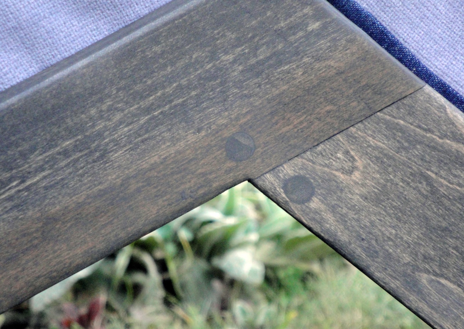
Embedded alongside the corks are the table legs.

Placed alongside the corks are the ends of the four table legs. The cork-pegs support the top of the table, and the top of table actually supports the legs. The pressure of the corks pressed together is enough to hold the table legs vertical in the top of the table. The result is considerable stability without any nails. The design relies mainly on the compressed corks for stability. It works too!

Sustainable Design through Upscaling

The other design ideal that I've aimed for is sustainable design through upcycling. Upcycling is the process of taking used materials and, through creative reuse, making them more valuable than they were before. This is one particularly bright future of recycling. As I said, aside from the clear acrylic table top (Clear Acrylic AR 1 if you're interested in making one), every part of the design is reused. Each wine cork, which are for the most part sustainably harvested in Portugal, is from a finished bottle of wine. Continuing with the wine theme, the iron ring which contains the wine corks is from an old wine barrel.

My mom had a bunch of wine barrel rings in her garden. Thanks mom!

The base of the table, too, is made from old wooden wine crates.

Each slat of wood is from an old wine barrel. The result is so pleasing to me that I want to make a table with this as the top.

In terms of a piece for potential production, material cost is a non-issue but material availability is. Now that I've learned how to make this table, I wouldn't say that the assembly is difficult. In terms of materials cost, the corks were free to me as were the iron ring and wine crates.  The chair cost me $35 to disassemble, and the acrylic top was $80 to have cut at TAP Plastics. I think that the materials would cost between $150 and $200 for each table. Finding those materials might be the hardest part about production. As I learned in the hunt for wine crates with beautiful typography burned into their surfaces, these old wooden crates are quickly becoming a thing of the past, now replaced by lighter, cheaper cardboard boxes. Only the most expensive wines are sold in wooden crates anymore. So, as an idea for furniture in production, this design would ultimately be faced with an absence of recyclable wooden wine crates. Nonetheless, the success I feel with the Wino signals to me the possibilities of upcycling as a force of sustainable design that goes beyond novelty appeal. I feel proud about the end product not just as an example of sustainable design, construction, and honest use, but as an aesthetic piece in itself.

Lessons Learned

I've learned a couple of things in the process of making this table. My biggest takeaway had to be that the design probably shouldn't always be planned out in advance of toying with the materials. Discovering that the peg holes in the chair legs were the same size as the wine corks was nothing short of an epiphany and really solved a lot of problems in the design, simplifying it, making the final product less susceptible to inaccuracies in drilling, and really getting me out of a slump. I wouldn't have realized this if I had thought out my design entirely before interacting with the materials. I think that I will steer my future designs towards a hands-on approach that allows these types of discoveries.

That said I do wish that I had created a plan for construction before I actually started building. I spent a lot of time just trying to figure out assembly.

Adding the final corks while trying not to disturb the alignment of the table legs or the circularity of the iron ring.
I think that this leads me back to the iterative process of design. The Wino, in terms of my assembly methods, should be seen as a work in process. If I was interested in pursuing this design further I would basically start over with the problems of assembly that I had and try to analyze and synthesize better solutions.

Tuesday, July 19, 2011

More Greek Design

I figured I should start doing things in series, so here are two more Greek-styled pieces of art. One is the Kraken, the other is Zeus. I'm not 100% happy with Zeus. I think I gave his face a little too much character, but he is what he is.