Showing posts with label illustration. Show all posts

Monday, December 12, 2011

1950s SciFi: Them! and Plan 9 From Outer Space

 I'm doing some more art for Little Red Bicycle based on bad movies. These two pieces are representations of Them! and Plan 9 from Outer Space, each using the colors of the yarn.


For Them! I drew an iconic movie still - the first time the giant radioactive ants appear on camera. This is the movie still I based the illustration on:
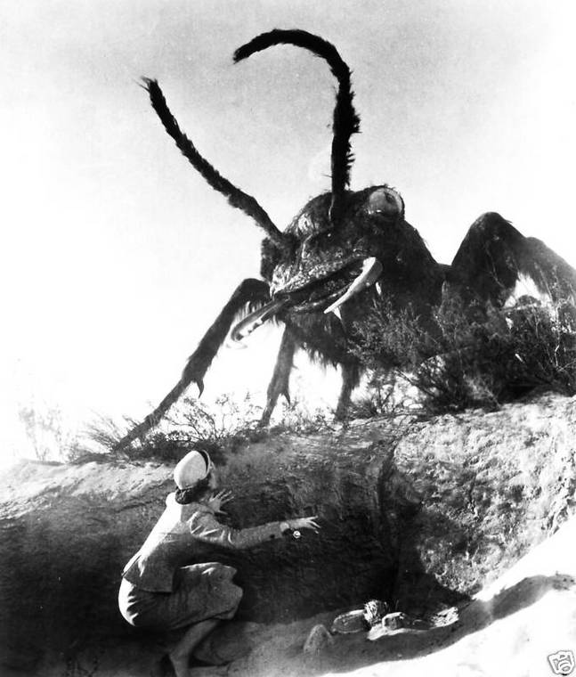

This was an interesting project because here I'm basically copying someone else's work right? I did this for a few reasons: the movie is actually good (despite its special effects) and has some excellent imagery, and budget constraints prevented me from spending a huge amount of time researching ant anatomy. This had me thinking as I went about rehashing this movie still as an illustration: what is my role as an illustrator? If the point is that this is supposed to look like a movie scene, then why am I drawing it?

I realized that there is a lot an illustrator can do when working from photos in the realm of clarifying and refining an existing image, much like someone touching up a photo. The ant effects aren't really that good in Them! and, though that's definitely part of its charm, as an illustrator I have license to improve the ant: to make it scarier and more defined, as in the detail shot below:


The art for Plan 9 is successful, I think, but it was more challenging. There are so many facets to the movie and the print size of this artwork is pretty small. So the task was to accurately depict the movie without cluttering the small image. The scene I ended up drawing involves a graveyard, the palm trees of San Fernando, flying saucers, and the living dead. I really did want to add in Vampira, the cheesy aliens, and Bela Legosi, but I don't think it would work visually.

I also recreated the text from the original movie poster which was pretty fun. Even the campiest typefaces have rigid rules that they follow.


Monday, September 5, 2011

Yarn-Bombing Fairy


A recent commission asked for a piece of fairy tale art involving yarn. My idea was to have this fairy do some yarn-bombing in an enchanted forest and this painting is the result.

First of all, this piece is heavily indebted to the incredible illustrator Virginia Frances Sterrett. She did 3 books in the early 20th century before she died and they're all masterpieces. Since I don't typically do this type of art, I looked to her paintings for inspiration and stylistic cues. I also turned to more familiar fairy tale art from Disney cartoons like Sleeping Beauty and Snow White. I combined watercolor backgrounds with opaque color-pencil characters and foreground elements to approximate the cel-based animation Disney used to use. Cel-animation is the style in which moving parts of the animation are painted on transparencies which are placed on top of static backgrounds. Time constraints and the opaque medium used on the transparencies create an effect whereby the backgrounds are much more detailed while the moving elements are done more simply and more quickly.

My favorite part.
Lessons Learned & Relearned

Overall I think that the piece is successful, but I consider it an experiment; I am definitely happy with the execution but I think there are a couple of changes I would make to the original layout and overall harmony of the individual elements if I were to do future, similar, pieces. I think the issue was that I was so concerned with executing the project correctly that I took less time designing it.

Doing this project refocused my attention on the importance of color schemes as the unifying aspects of a lot of art. Because the style I chose necessitates two mediums -- watercolor and colored pencil -- that don't really mix together I relied on a rigorous color scheme to bond it all together. My main colors where Naples Yellow, Cobalt Green, and French Ultramarine.

Finally, this project took much longer than I had anticipated. While extra time spent learning new techniques is invaluable rather than problematic, I spent a lot of time on details that won't really show up in the smaller printing size of the piece. Sadly, these are my favorite parts of the painting. The problem arose when I chose to paint at triple the required size, I think. I did this partially for portfolio reasons and partially because I didn't want to end up with any image resolution problems, and also because my recently upgraded computer is capable of handling that size. I should rethink scale next time to improve my efficiency.

Detail