
Showing posts with label little red bicycle. Show all posts
Showing posts with label little red bicycle. Show all posts
Sunday, February 26, 2012
Tuesday, January 31, 2012

Monday, December 12, 2011
1950s SciFi: Them! and Plan 9 From Outer Space
I'm doing some more art for Little Red Bicycle based on bad movies. These two pieces are representations of Them! and Plan 9 from Outer Space, each using the colors of the yarn.


For Them! I drew an iconic movie still - the first time the giant radioactive ants appear on camera. This is the movie still I based the illustration on:
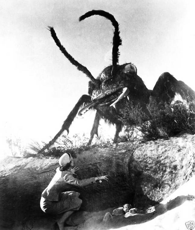
This was an interesting project because here I'm basically copying someone else's work right? I did this for a few reasons: the movie is actually good (despite its special effects) and has some excellent imagery, and budget constraints prevented me from spending a huge amount of time researching ant anatomy. This had me thinking as I went about rehashing this movie still as an illustration: what is my role as an illustrator? If the point is that this is supposed to look like a movie scene, then why am I drawing it?
I realized that there is a lot an illustrator can do when working from photos in the realm of clarifying and refining an existing image, much like someone touching up a photo. The ant effects aren't really that good in Them! and, though that's definitely part of its charm, as an illustrator I have license to improve the ant: to make it scarier and more defined, as in the detail shot below:

The art for Plan 9 is successful, I think, but it was more challenging. There are so many facets to the movie and the print size of this artwork is pretty small. So the task was to accurately depict the movie without cluttering the small image. The scene I ended up drawing involves a graveyard, the palm trees of San Fernando, flying saucers, and the living dead. I really did want to add in Vampira, the cheesy aliens, and Bela Legosi, but I don't think it would work visually.
I also recreated the text from the original movie poster which was pretty fun. Even the campiest typefaces have rigid rules that they follow.

Wednesday, October 19, 2011
Day of the Dead
This one I'm pretty proud of. Once again on assignment for Little Red Bicycle, I had to create a stamp for yarn packaging. My guidelines were to use certain colors and do something day of the dead themed. This is the art I created:


I wanted to use these with this project because when I think of Mexico and Mexican art one place I turn is towards street art and murals, which are done with spray paint.
I'm trying to master pattern making as well, and what better subject than Day of the Dead to try some patterning out? I think my candy skulls work well. I didn't want to make them insanely detailed because they are background elements, and I think I needed to keep some balance between the business of the face and background areas.
One thing I tried that didn't work was simulating a bad press job, where I would apply grains to each of the separate colors in the piece, as if I had printed all the purple on one block, the pink on another, etc. The piece is so busy in the first place that it ended up being distracting and ugly. Though, if you notice the text, I did mimic poorly aligned printing/stencil art in the process of making the print more legible.
Overall I'm really happy with this and I want to do more work like it in the future.

I owe some credit to Didi for the baller colors. And thank you Alycia for letting me use your face.
For a while now I've been taking training courses in Illustrator and naturally I want to try and use the stuff I learn. What I was really able to take advantage of this time were gradient meshes. Gradient meshes allow you to simulate a kind of airbrush effect when done correctly. These are the gradient meshes in my piece:

I wanted to use these with this project because when I think of Mexico and Mexican art one place I turn is towards street art and murals, which are done with spray paint.
I'm trying to master pattern making as well, and what better subject than Day of the Dead to try some patterning out? I think my candy skulls work well. I didn't want to make them insanely detailed because they are background elements, and I think I needed to keep some balance between the business of the face and background areas.
One thing I tried that didn't work was simulating a bad press job, where I would apply grains to each of the separate colors in the piece, as if I had printed all the purple on one block, the pink on another, etc. The piece is so busy in the first place that it ended up being distracting and ugly. Though, if you notice the text, I did mimic poorly aligned printing/stencil art in the process of making the print more legible.
Overall I'm really happy with this and I want to do more work like it in the future.
Saturday, September 24, 2011
Galapagos Stamp
Did another piece for LRB yesterday. This one is a Galapagos Stamp


I'm pretty happy with this piece for a couple of reasons. 1. I think it looks great for a single color print, and 2. It took me 5 hours to make.
I've been dedicated to learning more about Illustrator and while I haven't learned how to achieve certain looks that I was incapable of achieving before, I have become smarter and faster in my workflow, using pathfinder options and clipping masks to reduce hand editing and, what I used to do, moving the work into Photoshop to apply textures. So, using compound shapes and global colors, the execution phase of my design work has sped up dramatically. Yay me.
The color is based on Didi's colorway, which itself is based on the color in this picture she took last year in the Galapagos:
It's a beautiful but unusual considering the things I think of when I think of the Galapagos. I think of reds, blacks, and whites for the bones of animals, the magma rock, and the spots on the Marine Iguanas. I think of Blue-Footed Boobies, and Galapagos Tortoises.
Anyway, it worked out well!
Saturday, August 20, 2011
Stamp Art
The theme for my latest commission was travel, and more specifically East Asia. This is my final product, and I'll walk through my inspirations for the finished piece.


The beautiful deep reds and gold made me think about Indian dancers performing the classical dance Bharata Natyam, as seen here:


I found these women incredibly gorgeous and knew that these dancers would form the centerpiece of whatever came out of this. Adding the travel aspect to the piece took more thinking time. My girlfriend suggested to me those stickers that people used to get on their briefcases whenever they traveled to new towns and countries and it clicked in my head: postage.
As it turns out, there are several examples of beautiful postage design from India out there:


I was provided with a specific image as inspiration, this great photograph from user ~FurSid:
I found these women incredibly gorgeous and knew that these dancers would form the centerpiece of whatever came out of this. Adding the travel aspect to the piece took more thinking time. My girlfriend suggested to me those stickers that people used to get on their briefcases whenever they traveled to new towns and countries and it clicked in my head: postage.
As it turns out, there are several examples of beautiful postage design from India out there:
As it turns out, these dancers are already on postage.
The etched stamps drew my eye. Not only did this style remind me of contemporary artists like Sheppard Fairey, but the older forms of etching and press printing fit my limited color palate of red and gold. So I sketched out a dancer.
I'm pretty happy with it and this project has made me interested in moving on to larger scenes, with more pieces as opposed to single figure designs.
Subscribe to:
Posts (Atom)