Monday, April 9, 2012

MegaJoule


This is a logo I did for a website called MegaJoule. The website will be a kind of network for energy analysts and people interested in energy numbers and predictions.

The trick with this logo was that the site needs to have credibility and and yet be more upbeat, as it will be a network that relies on users coming back over and over.

Credibility was a complex thing to think about, typographically, because it was entangled with "tech" and a "hard numbers edge" in this business. I visited some sites that I deem to be credible (Wikipedia, Britannica, NYTimes) and went through my font collection looking for something that said the right things to me.

My first pass was interesting. I had a few very different selections.


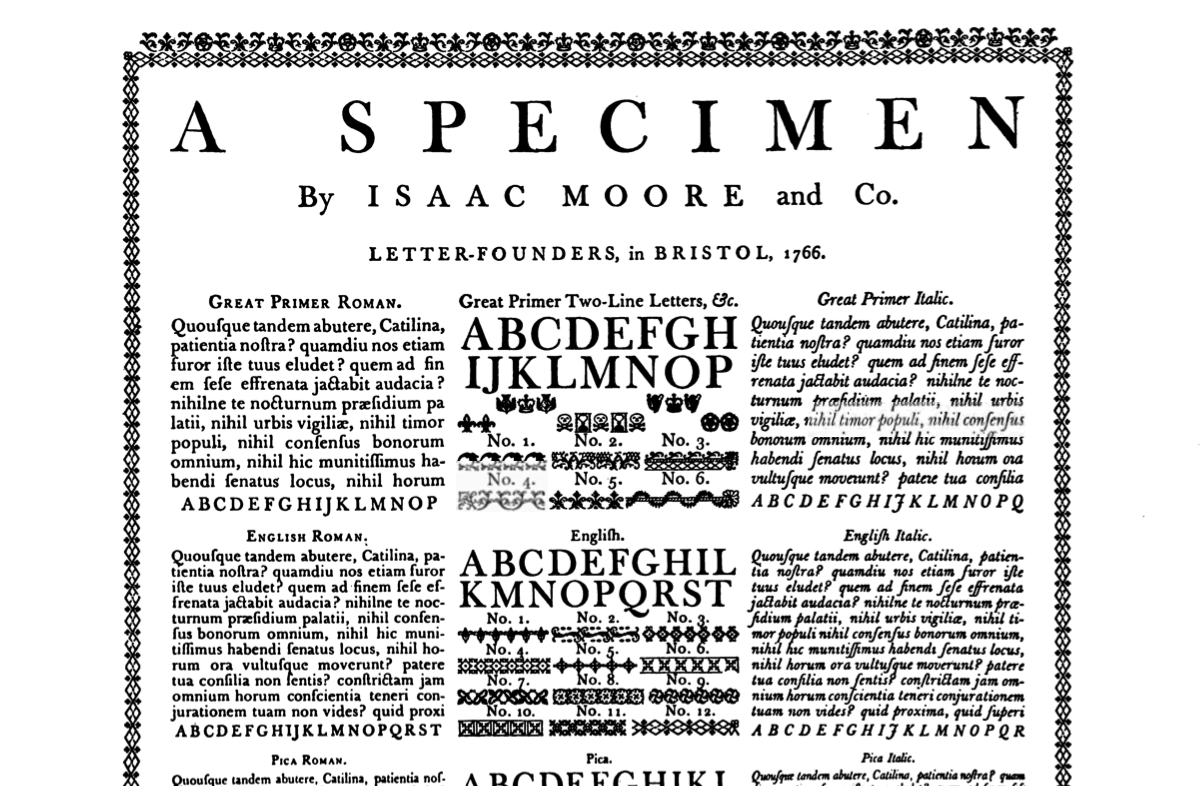
I thought of Baskerville. For me I think of Baskerville next to steam engines, industrial-era technology. All of these energy-related inventions of the 18th and 19th century say "Baskerville." The problem is that this is the 21st century.


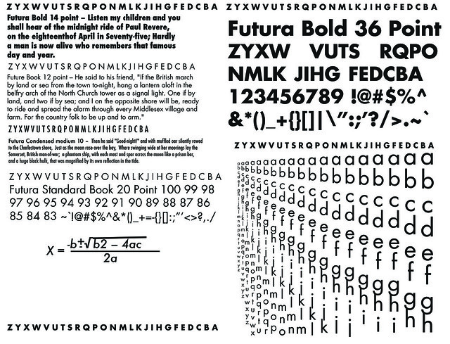
Futura, even though it's pure art-deco, is a very current looking typeface. It's problem is that it doesn't say credibility the right way: it's too exciting.


I settled on Junction, by The League of Movable Type. It's a humanist sans-serif, so it's got a liveliness that other sans-serifs don't have, but it has lines that can work together to create a solid block of text, which creates a sense of seriousness.

I would also say that the "credibility" I was looking for in typography came out more in how well the logo turned out as a whole. That is to say a well-designed logo automatically gives a product some extra credibility.

Feministy Logo


This is a logo I did for Liz Abinante's Feministy, crafter of uniquely simple knitwear designs. When we started discussing a logo design, we reviewed a bunch of other knitting-related logos and found that, in many cases, knitting imagery like yarn, yarn balls, and knitting needles were heavily used. I felt that moving away from that would help differentiate Feministy from other designers out there.

One thing that Liz wanted in her design was her name: some know her as Feministy, others as Liz. A good logo would form a single image of her.

So naturally we turned to her as an starting point for the design. Liz herself is a big part of why her business succeeds - she sells knitwear designs yes, but also easy and clear instructions, and useful and personal feedback - this is a designer you want to know. While we were talking, she came up with the term "knitting mother" and we really clung to that. We coupled the "knitting mother" concept with her fashion, interests, and the word "feministy" itself; she's a fan of vintage fashion - and that '50s-'60s Mad Men thing is certainly en vogue - and domestic arts. But she's no 1950's housewife, she's a modern woman, an entrepreneur who is interested in playing with the idea of '50s woman, celebrating it at the same time that she flips it on its head. She's "Feminist" but cuter and more playful: "Feministy".

This is the idea that emerged as the winner in the initial concept phase. It's hard, when you've got something that seems to click so well, to imagine doing anything else. Though she does knitwear and the patterns of the designs are beautiful and seemingly opportune for a logo, they have less to do with her.

Here is my initial sketch for the logo:


Saturday, March 24, 2012

Alas, poor Yorick!


This is a t-shirt design I made and hopefully it will get printed by Threadless or, if not them, another tee company. The design is called "Alas, poor Yorick!" as it is inspired by the famous scene in Hamlet where Hamlet stumbles upon the skull of the court jester Yorick, a childhood friend. The moment encapsulates many of the major themes in the play. The skull of a clown... it is a macabre and carnivalesque image, and I've tried to draw insanity and madness and death and melancholy into the visual with the day of the dead-English gothicism of the design. 


The design itself is actually a redo of a poster I made a few months ago. Working with the old file has really opened my eyes to how much I've grown with Illustrator in these past few months.